As we’ve shared… our designers came home from the Circles Conference with a creative mindset, ready to hit the ground running with everything they learned from prestigious leaders in the design industry.
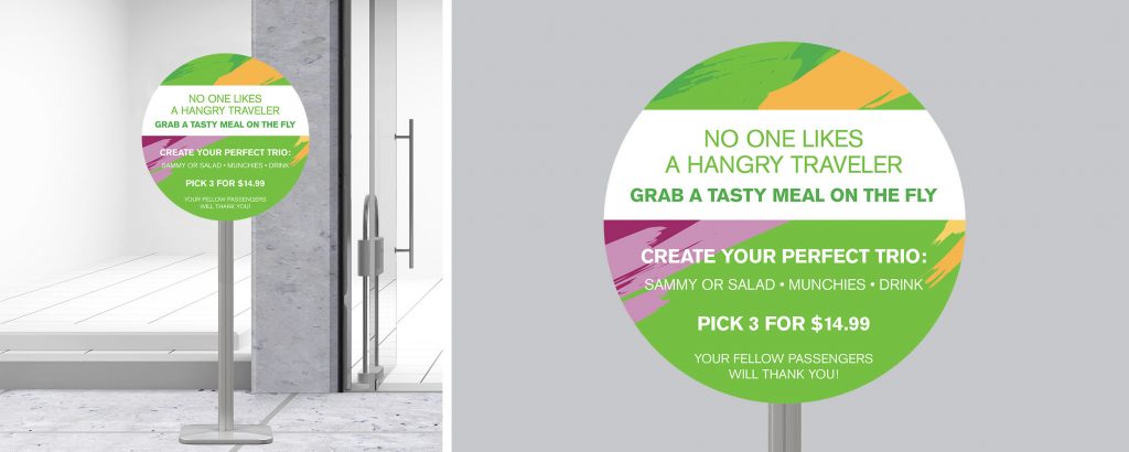
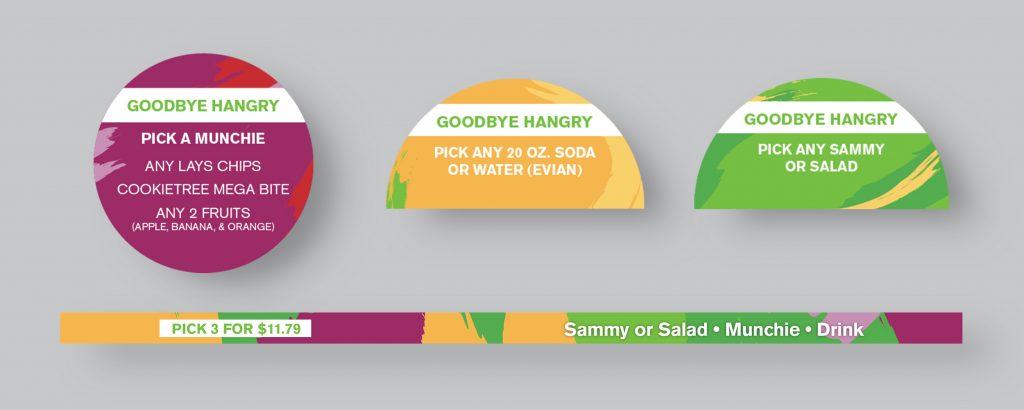
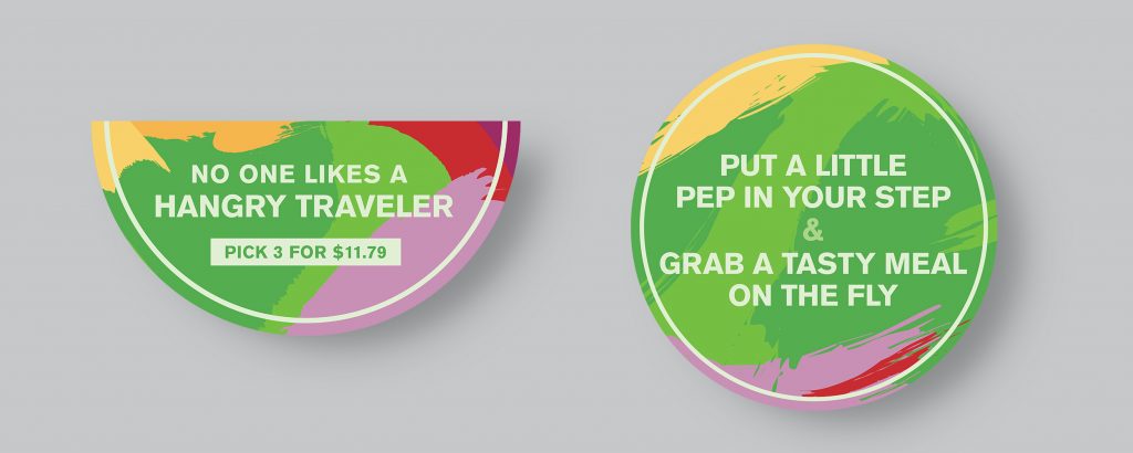
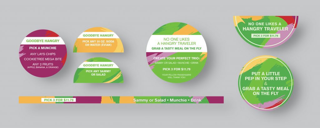
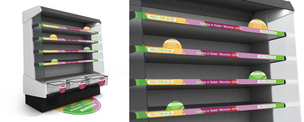
For one of our first projects post-conference, we polished up our new mood board knowledge. Novak Birch was tasked with designing a retail signage toolkit for a “Pick 3” deal inside HMSHost airport grab-and-go kiosks at six pilot locations. Since the current kiosk merchandising had the “Pick 3” products spread out around the kiosks, we had the challenge of bringing awareness to the deal. Additionally, each kiosk had different layouts, refrigerators, and shelving, so we had to make this toolkit flexible for it to work effectively in each location.
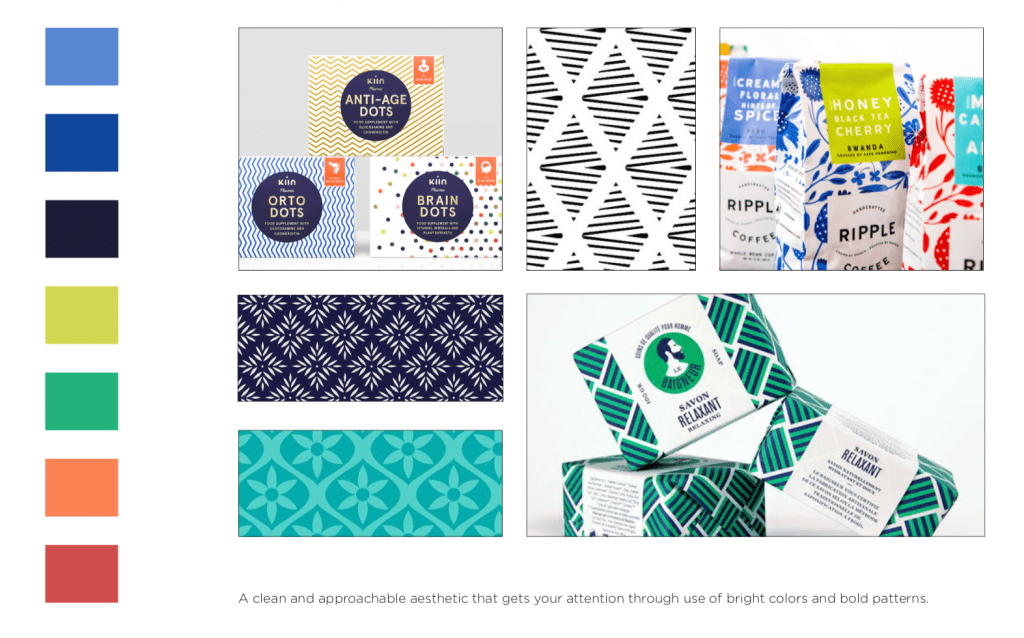
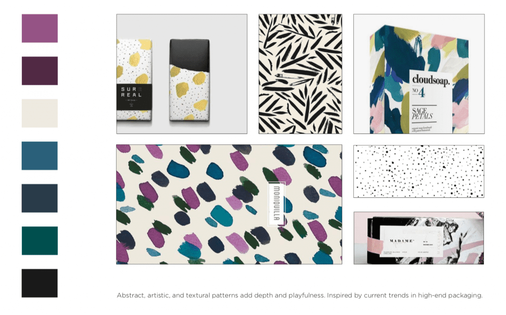
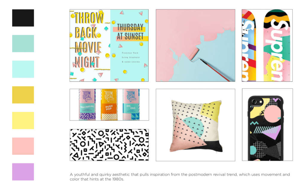
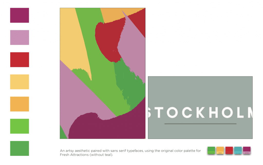
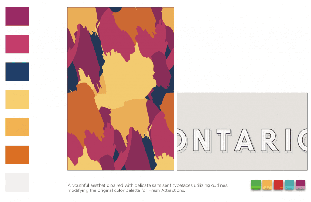
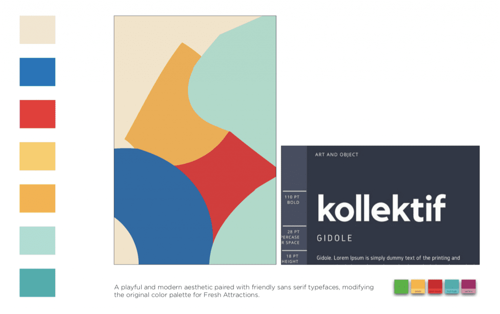
The client wanted a fun, quirky, and health-conscious tone, adding convenience to the customer journey. We developed mood boards with this tone in mind, ranging from streamlined to trendy, and shared them with the client.
After showing the client the mood boards above, we got great feedback. The client wanted elements from multiple mood boards: a more simplified version of the second and third boards that utilize abstract blocks of color in a playful way, along with the modern fonts similar to the third board.
They gave us additional direction that they wanted to incorporate an existing color palette from a product line. After looking at their color palette, we explored different ways of modifying the palette to complement any existing materials. Once we had determined the color palettes that were working, we used Illustrator to play with different paint brushes, exploring various textures and shapes to bring the artwork to life.
The client chose the first board—they felt it embodied the cheerful spirit and fresh feeling they desired, and they could imagine it on their POP.
Next up… we brought the vision to life! We worked on different pattern and brushstroke variations, so the pieces would feel scaled to each individual application, whether for a small shelf-talker or a large floor graphic.
In the end, using the mood boards in the initial stages helped with the tight timeline for production. We had to move quickly and ship to all six locations for installation. Getting the concept right before moving into the next phase allowed our team to focus their energy on the logistics, copywriting, and production design.
Thanks again to Joe Duffy for sharing his wisdom at the Circles Conference about how to use a methodical approach to eliminate the possibility of surprising our clients. We’ll continue to finesse our creative approach to mood boards while keeping our clients looped into an open dialogue to streamline the custom design marketing process.
