It’s officially 2020! New year, new you? The kick-off of a new year might have you dreaming of a refresh of your brand. Now’s the time when we tend to do a self-assessment of our logo and marketing communications, eager to embrace new trends and make some changes.
But let’s take a look at what this might look like for your company. And if it’s even a wise decision.
What’s in a Brand?
A brand isn’t just the information you communicate to the world—it’s how the world sees you. So while you can carefully craft your brand identity (logo, tagline, color palette, fonts, etc.), your brand transcends that. For more on this, read our blog post.
A memorable brand incorporates your personality and value proposition, leaving you with an authentic narrative that best represents your organization and resonates with your audience.
Before you take the risk of rebranding your company, it’s important to seriously think about whether you should retool your brand in the first place. If your target audience is changing with the times, it’s a smart move to change along with them.
Refresh vs. Rebrand
Rebranding can be necessary, but more often than not, a brand refresh is what companies really need.
A rebrand is basically the full shebang—an overhaul that can go as far as renaming your business. If your current brand identity is confusing or misrepresents the core of your company’s mission, then you might be ready for the extensive process of rebranding.
On the other hand, a refresh can breathe new life into what’s already there. It’s right for you if you can build on a solid foundation. Are all of the core elements of your brand (positioning, strategy, services, competition, audience) intact and relevant? Consider a brand refresh.
Elements of a Brand Refresh
If your current brand is established, with your positioning statement, messaging, and brand strategy all working together nicely, then a brand refresh is the way to go. A brand refresh is perfect for those with a logo, color palette, and design system that are lacking clarity. Focus on your refresh if you’re not planning on dramatically altering your products and services.
Many of these pieces can be done independently of one another, and they can be as small as changing fonts all the way to developing a new logo.
Elements might include:
- Updating your tagline or brand messaging
- Revisiting your color palette
- Expanding your design system
- Updating fonts
- Updating your logo—either tweaking the existing logo or designing a new one
- Updating marketing collateral, stationery, and packaging
What Makes a Refresh Successful?
You decided to go with a brand refresh—an update of this, a tweak of that. How do you know if you pulled it off? Let’s take a closer look at some big brands that have successfully refreshed their established brands.
Southwest Airlines
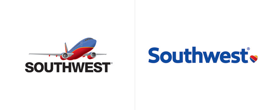
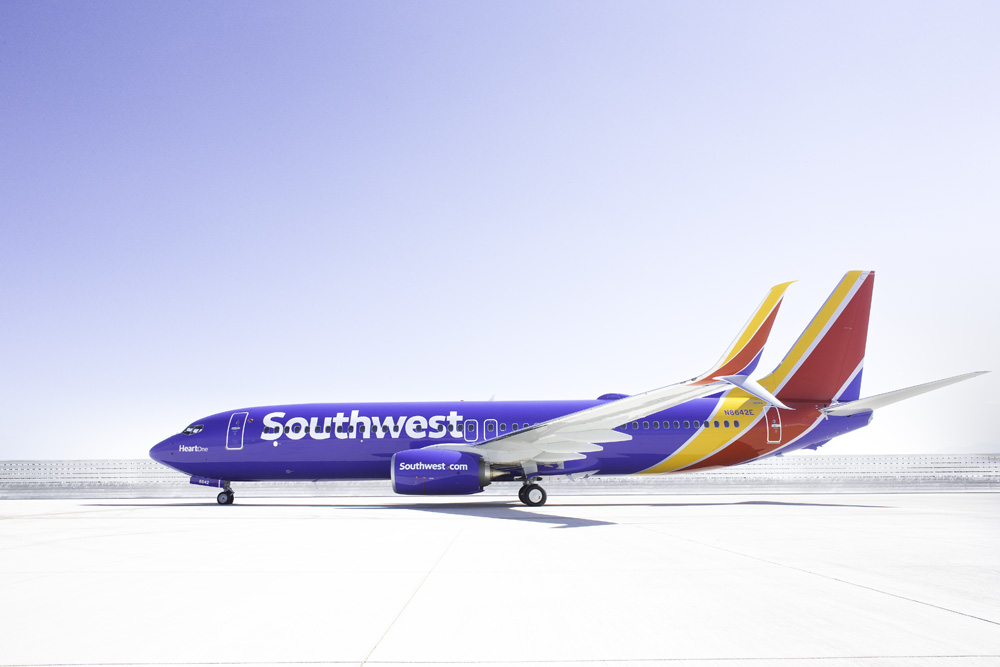
From planes to snack packaging, the refresh is modern but true to Southwest’s DNA: confident, authentic, and full of personality.
Southwest Airlines’ brand refresh is a great example of how you can infuse a brand with personality to appeal to new customers while still being true to your core audience.
Developed by Lippincott, the new visual system uses several elements to accomplish this, including:
- The new modern heart pays homage to their original logo from 1971.
- A custom, proprietary typeface by Monotype Studio brings a punch of character.
- The bright colors, cheerful font, and energetic application of their branding all come together to create an authentic voice.
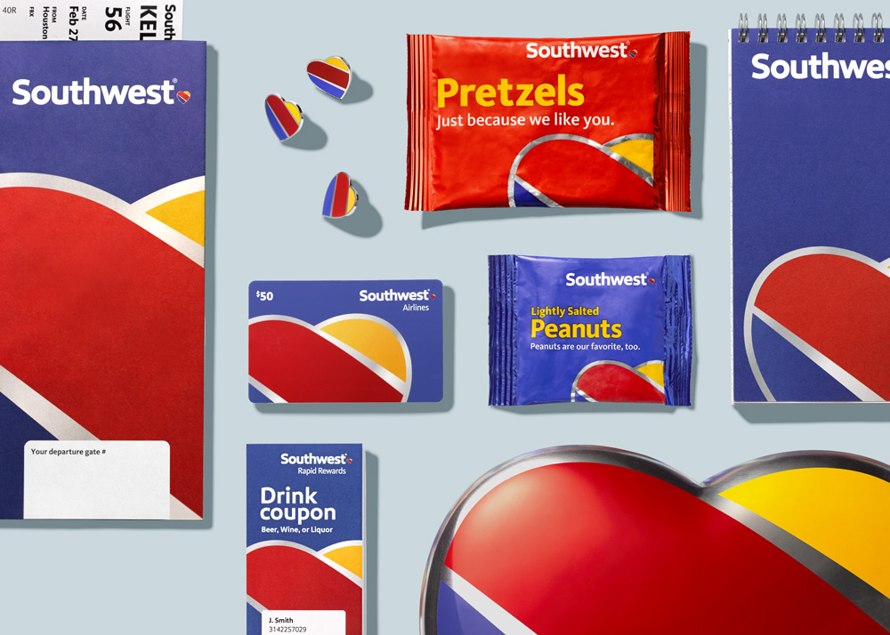
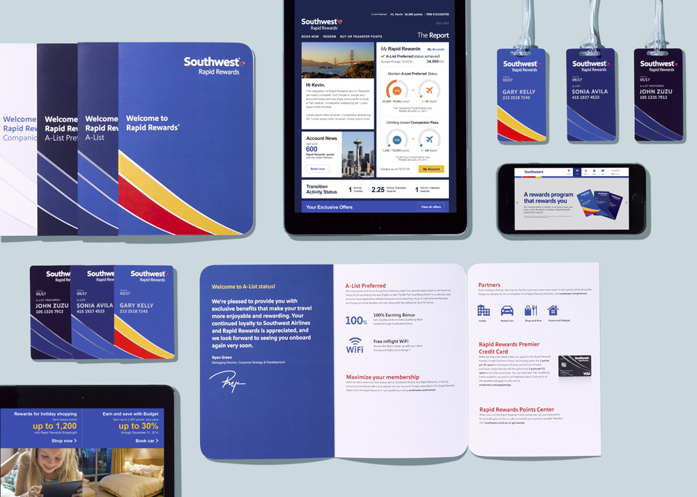
But perhaps the best part of the Southwest refresh is the strength and consistency of its application across all touchpoints, from environmental (e.g., check-in desk, directional signage, and planes) to smaller materials (e.g., snack packaging, printed booklets, pins, gift cards, and drink coupons, as well as their digital presence).
Fisher Price
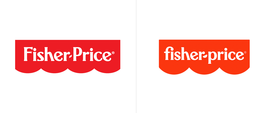
Renowned agency Pentagram recently launched a brand refresh for Fisher Price. The old logo was quite iconic, and the new logo evolves both the graphic element of the awning along with the quirky typography.
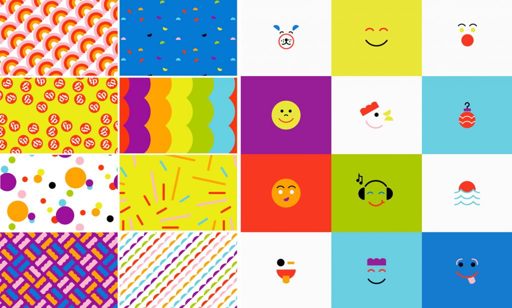
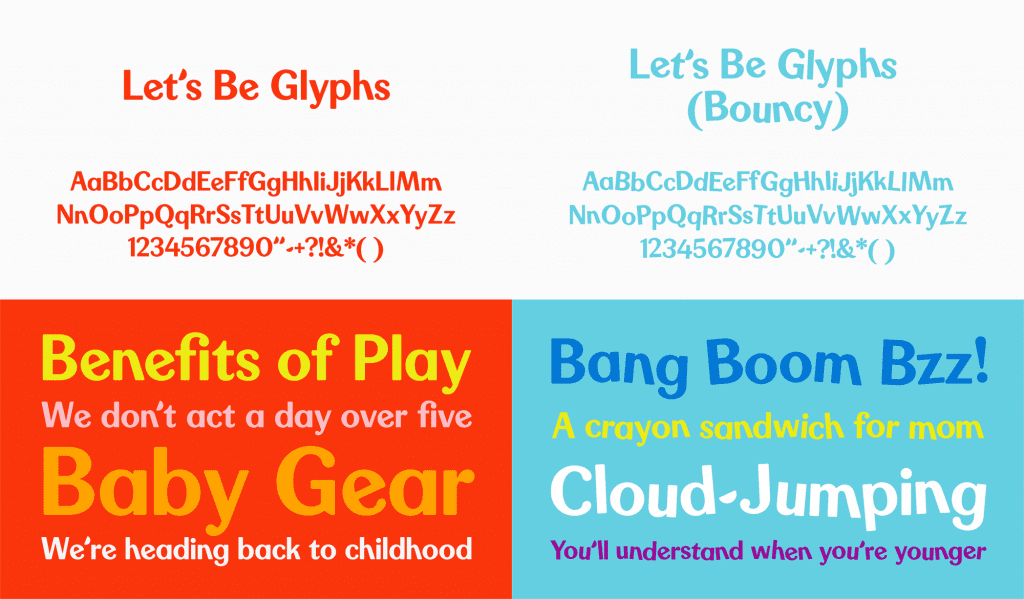
The refresh reaches far beyond the logo. It features a custom type family, tagline, illustrations and patterns, and promotional applications. These elements all come together to evolve and modernize the existing brand identity, while staying true to who they are.
University System of Maryland
Novak Birch created a new logo for the University System of Maryland (USM) that united its 12 institutions, two higher education centers, and system office while communicating its commitment to the state.
We delivered a professional, adaptable logo that better communicates USM’s strategic goals and key messages while positioning it as an innovative, forward-thinking leader in higher education. Key elements include:
- The stained glass shield is reminiscent of the shape used in the previous USM logo, offering a sense of continuity and ensuring brand recognition while still modernizing their look.
- We used the colors and club shape from the Maryland flag to highlight USM’s connection to—and pride in—the state.
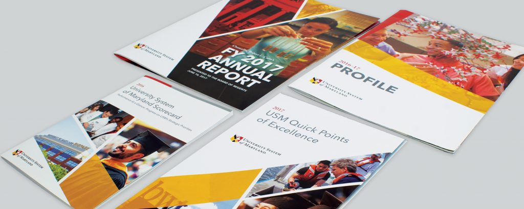
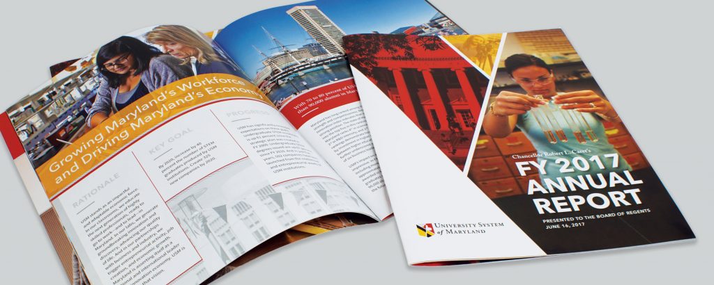
Then, we designed a new graphic identity for USM’s key print communications (e.g., annual report and USM Profile) that echoes the logo aesthetic. We also wrote and designed a user-friendly style guide to ensure that the logo is correctly and consistently used in future pieces. The new suite of materials offers a consistent, professional appearance that reinforces USM’s position as a leader in education, research, and service.
